
01
User flows before pixels
The two or three jobs your app exists for, mapped as flows with the dead ends and the pointless confirmation steps removed. This is a day of work that regularly saves a fortnight of building.
Your #1 Technology Partner · Cainta, Rizal · 24/7 AI-assisted support
Mobile App Development
Every screen agreed, tested on a real phone, and handed over as files you own — before anyone writes code.
Mobile app design in the Philippines usually gets skipped: someone describes the app in a chat thread, a developer guesses, and the first time anyone sees a screen it has already been built.
A phone cycling through the home, service, booking and profile screens of a Philippine home-services app, ringed by home-screen icon, push notification, offline sync and app-store cards.
Your own app on their phone — booking you in a few taps, signal or not.
Source files handed over, not flat images
Empty, loading, error and no-signal screens designed
Prototypes tested on handsets, not on a laptop
Projects delivered
The two or three jobs your app exists for, mapped as flows with the dead ends and the pointless confirmation steps removed. This is a day of work that regularly saves a fortnight of building.
Grey-box screens with no colour, no logo and nothing to be polite about. Disagreements about what goes where belong here, where a change takes minutes rather than after the interface is finished.
You tap through the actual flow on your own handset instead of watching a slideshow on someone's laptop. Booking, ordering, browsing — you find out how it feels in the hand before a developer is booked.
Not just the happy path. Empty lists, loading, errors, no signal, payment failed, no results, success. These are the screens that get skipped in a chat thread and then get built badly under time pressure.
Colour, type scale, spacing, icon set, buttons, form fields and states, built as reusable components in Figma and mapped to Flutter widgets. Screen forty then costs a fraction of screen four.
Specs, exported assets at every screen density, the app icon, store screenshots, and a walkthrough call with whoever is building it — us or your own team. The files are yours from the day they exist.
Who opens this app, what they came to do, and what they do today instead. We look at your enquiries, your chat threads and your booking sheet, not just a feature wishlist.
You get: A written brief with user flows and a screen inventory
Grey-box screens for the whole journey, reviewed with you fast and changed faster. Structure gets settled before anything gets styled.
You get: Wireframes for every screen, revised and signed off
Full visual design in your brand, built from reusable components with iOS and Android conventions handled where users notice them.
You get: Full UI designs plus a Figma component library
Five to eight people do the real task on their own phones while we watch where they hesitate — and we watch rather than ask their opinion.
You get: A clickable prototype and a ranked usability findings list
Specs, assets, icon and store screenshots packaged up, with a walkthrough for the developers who will build it.
You get: Figma source files, exported assets and a developer spec
What we build with
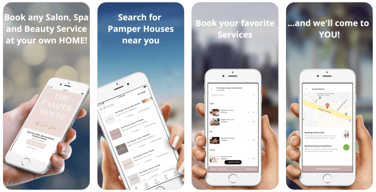
Beauty & Wellness
Booking flow designed around choosing a treatment, an address and a time in a handful of taps.
Read the case study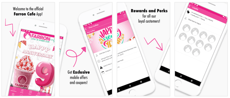
Restaurants & Food
Loyalty screens that show points, rewards and what's needed for the next one at a glance.
Read the case study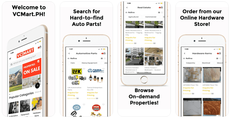
Retail & eCommerce
Catalogue and checkout screens laid out for thumb reach on a one-handed phone.
Read the case studyPlan your project
Tell us what you need to improve. We will recommend the right scope and practical next step before preparing a proposal.
Questions
Something not covered? Message us — a real person from the team replies, usually the same day.
Ask us directlyYes. You get Figma source files, a component library, exported assets at every screen density, the app icon, store screenshots and a written spec, plus a walkthrough call with whoever is building it. We are not precious about it — the files are yours. If your developer later needs a change to the system, that can be a small piece of work rather than reopening the whole project.
UX is the order of the screens and the number of taps: can someone book, order or find a listing without stopping to think? UI is how it looks and feels once that is settled. On a small business app the UX work is a few days of flows and wireframes, and it is where the money gets saved. Beautiful screens over a confused flow still produce an app nobody opens twice.
Five to eight real users on their own phones, over mobile data, doing the actual task — book the appointment, find the unit, redeem the reward. We watch where they hesitate rather than asking whether they like it, because people are polite and hesitation isn't. Sessions run in person or by video call in whichever language they are comfortable with, and you get a written list ranked by how many people hit each problem.
Where users notice, yes. Navigation, back behaviour, share sheets, date pickers and system fonts follow each platform — Material 3 on Android, Apple's guidelines on iOS. Everything else stays one design so your brand doesn't split in two and the build stays on one codebase. We tell you which differences we are keeping and why, rather than leaving you to find them after launch.
Two structured rounds per stage — wireframes, then UI — plus small adjustments as we go. The structure matters more than the count. A change at the wireframe stage costs minutes, the same change after the interface is finished costs days, and after the build it costs money. That is the entire reason we design in stages instead of showing you a polished screen first.
Yes, and they are part of the handover rather than an afterthought. That means an icon that still reads at 48 pixels on a crowded home screen, plus store screenshots and captions sized for everything Apple and Google ask for. Those images are the closest thing an app has to a shopfront — they are what someone judges before they decide to install.
We follow it, then extend it. Most brand kits were built for print and web, so they need work before they survive a small screen: contrast that holds up on a phone outdoors, a type scale that stays readable at small sizes, tap targets big enough for a thumb. Those decisions get written down as a design system so the app stays consistent as it grows.
Tell us how your business works. We'll come back with a clear recommendation, a timeline and a price — no obligation.